Visual Redesign to Enhance Learning
Part of my work as a MOOC designer/instructional designer is the visual redesign of slides or any course materials. Frequently, slide decks for studio recordings arrive on my computer filled with just sentences, sentence stems and/or bullets. The goal of redesign work is to convey the instructor’s ideas more accurately and fully by designing a more directly accessible visual message. This work taps on my message design and graphic design skills to make the material as accurate and aesthetically appealing as possible. I believe that “aesthetics matter” (see University of Edinburgh’s Manifesto for Teaching Online). I also really want to avoid the use of bullets in PowerPoint slide decks. To illustrate what I mean, I’ve included a few examples below.
Example 1:
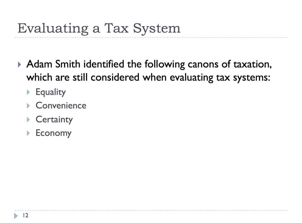
Before, when slides for video recording first land in my hands:
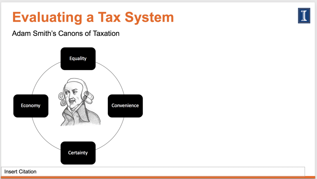
After, when I have redesigned it. Some of you may ask if it is accessible. It is. I make it accessible by adding alt texts and using the SmartArt option in PowerPoint. If learners download the slide deck, they can access the accessible slide deck; if it is just viewed via the video, then, they would just follow along with the transcript on the video.
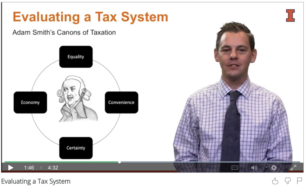
Inside the video with the slide in the background (and Professor Petro Lisowsky):
I’m always, always looking for ways to avoid the use of bullet points and to convey a series of ideas in a visually simple format. I ask, How else can I tell the story?
Example 2
This example illustrates how I enhance a teaching concept with visual redesign.
Before:
After, when I’ve redesigned it:
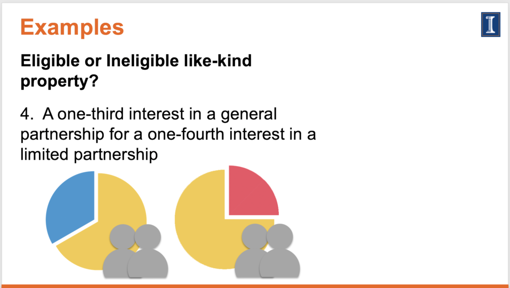
Same principle in Example 3.
Example 3
After, when I have redesigned the slide:
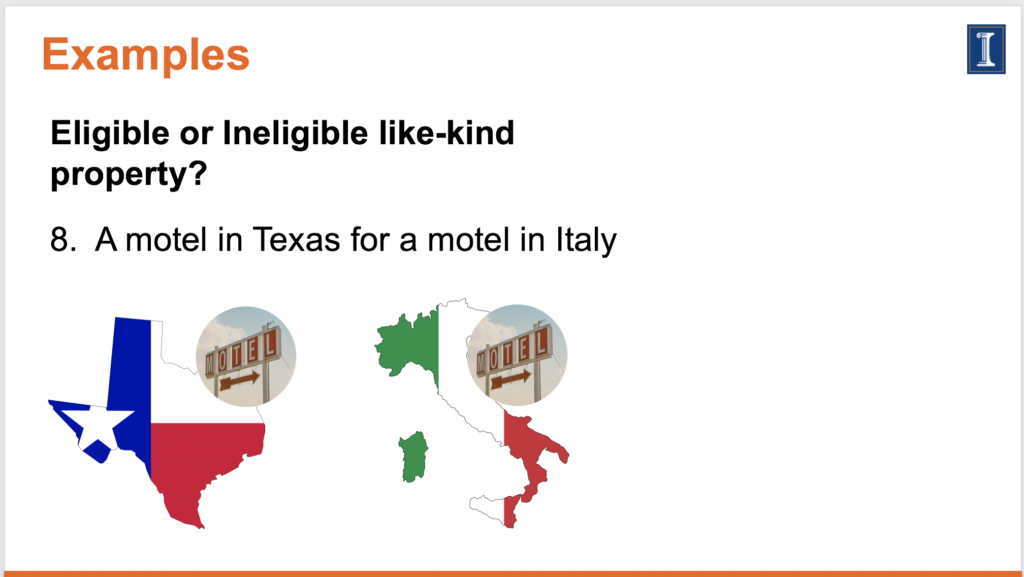
Learners can quickly grasp the concept with the visuals of the motel and the maps of Texas and Italy. Also, learners are now accessing content for just-in-time learning via their mobile devices. The visuals and the text together will make the message clearer and more directly available to the learner.
You May Also Like
What makes a strong narrative for design?
March 30, 2012
About That Poster Presentation at AECT 2019
November 2, 2019