Awesome Excel Chart Quick Tips for Web Display
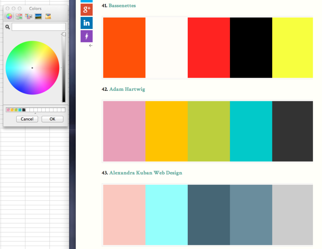
A google search led us to the Betterment site with a collection of web color palettes. The palette for us had to allow for high contrast and yet be aesthetically pleasing. #42 – Adam Hartwig‘s palette it is. Thank you, Mr. Hartwig! [Note: He has a pretty awesome website himself, check it out.]
Creating a Palette in Excel (Mac computer)
I had no idea how to insert Hartwig’s palette into Excel’s color charts. As far as I could recall, Excel had no option for a user to enter hexadecimal web color codes. Once again, Tom came to the rescue.
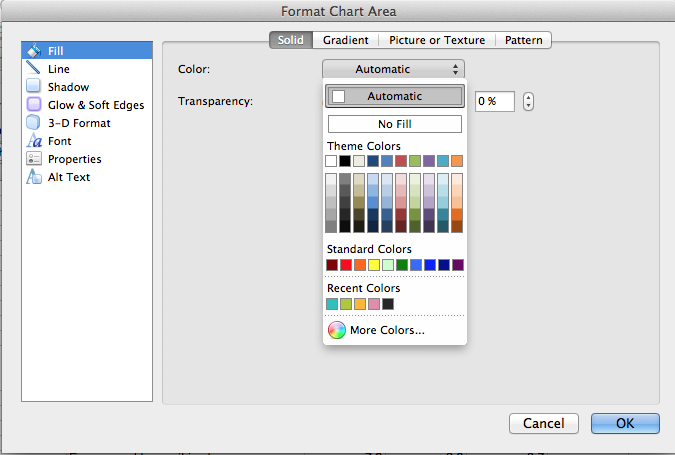
On an iMac, double-clicking on the chart area opens up a Format Plot Area window. From there, select Fill > click on the drop-down menu besides Automatic > select More Colors.
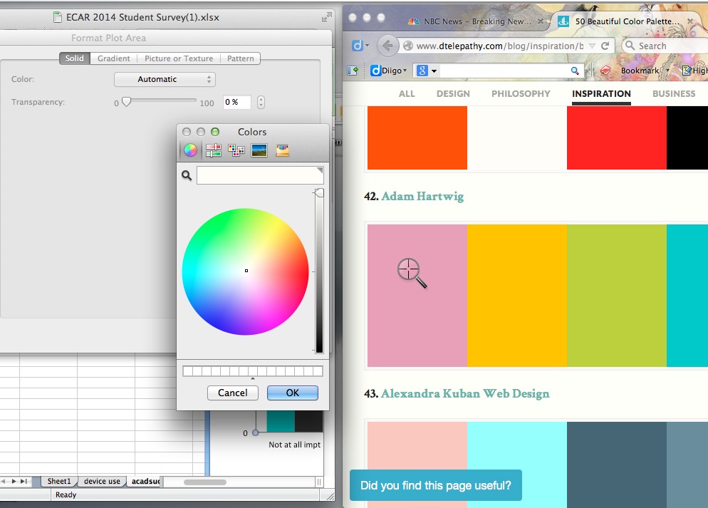
Make sure you are then on the Color wheel tab (see image below). See the Magnifier icon beside the white color box? Click on it and it turns into a color dropper.
I had Hartwig’s color palette open just beside the color wheel window. I clicked on all 5 colors and they showed up right away on the white little swatch boxes below the color wheel.
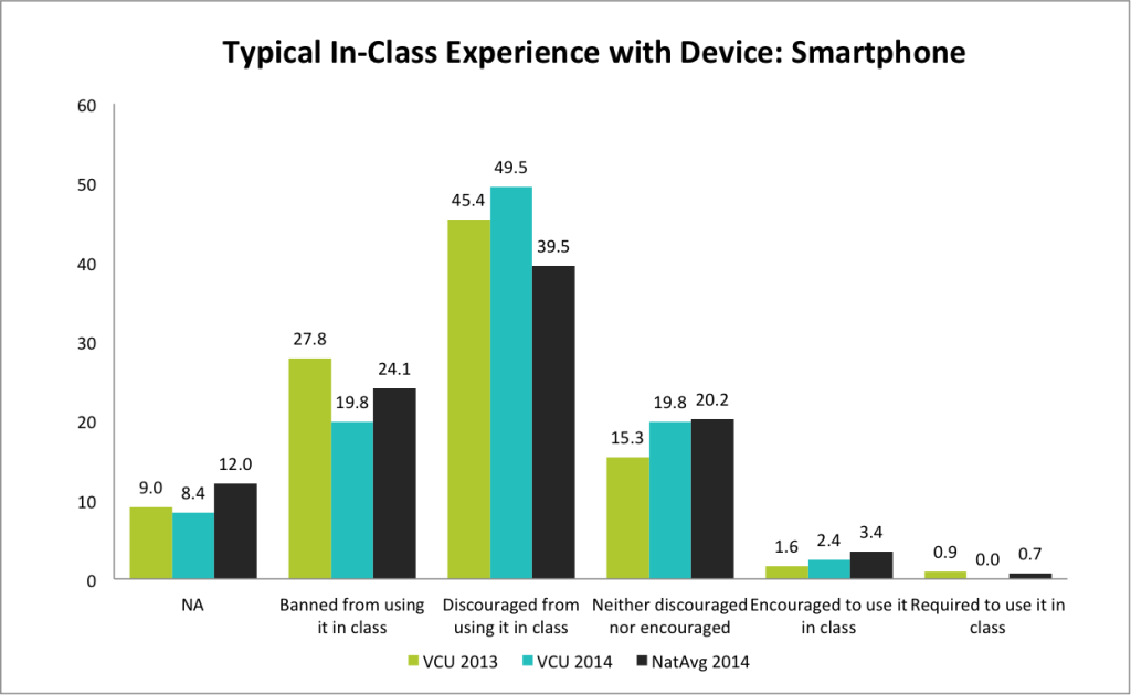
Back to my Excel charts with this color palette. At first, I thought this arrangement looked okay, but after applying it to the existing charts, it began to look a bit too bubble-gummy and jaundiced-looking. Especially if I just had 2 columns of data – VCU 2014 and National Average 2014 to compare (yellow and green; yellow and green, … yuk!). I couldn’t tolerate it too long and didn’t know how anyone else could.
So after I had reformatted all the charts to the pink-yellow-green palette, I decided to switch it to another color arrangement – green, turquoise, black. It seemed to look more professional.
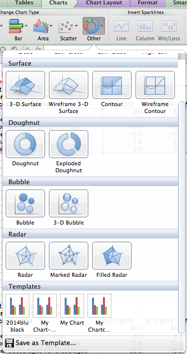
How could I change all 70-something charts to the same color palette efficiently? The solution is to save my preferred Chart Style as a template. This option is available under the Chart > Other (Chart Type) menu. Click on the dropdown menu > Scroll to the bottom. See the Save as Template phrase?
Even though I was a research assistant in grad school and processed much survey data, I had not once thought of how the chart colors might look set against an entire website. This perspective is new to me. I’m happy to learn time-saving ways to speed up the work process. Thanks Tom and Adam Hartwig!






One Comment
stanlyam
Thanks for sharing Yin, i think it might be useful to bookmark this in Diigo too